EXPERIMENTAL DATA
To see the raw data collected during my project click the spreadsheets below. To see the different testing locations and times of year, use the tabs on the bottom of the spreadsheets. They are separated by season and have all of the data collected from the weather to space data to the GPS errors.

SELECT COMPARTIVE STATISTIC FIGURES
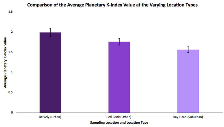
This graph shows the difference in the average Planetary K-Index values at the varying types of locations throughout the process. This is representative of the significant result of the ANOVA statistic that was run. Standard error bars were added to account for error in the data collection process.
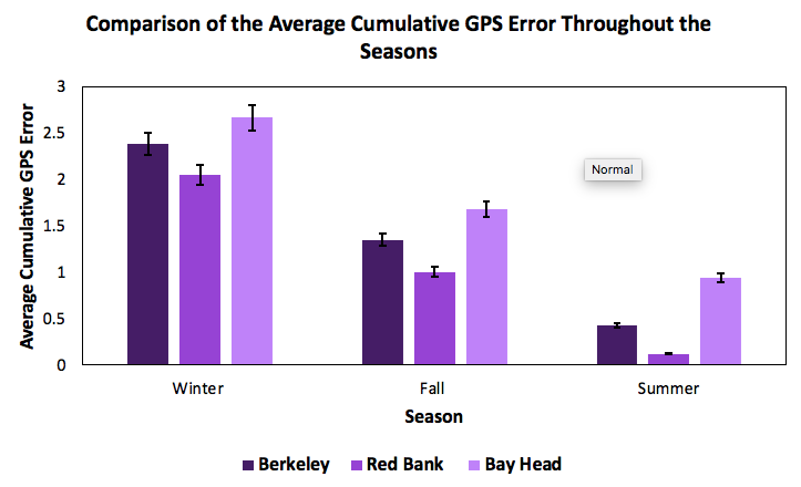
This graph shows the difference in the average cumulative GPS errors throughout the seasons at each location. This is representative of the significant result of the ANOVA statistic that was run. Standard error bars were added to account for error in the data collection process.
SELECT REGRESSION FIGURES
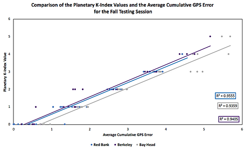
Below are important figures that were created that display positive correlation between Planetary K-Index Values and GPS errors throughout the seasons.

CORRELATION BETWEEN GPS ERRORS AND PLANETARY K-INDEX VALUES IN THE WINTER
This is a scatter plot of the average cumulative GPS errors that correspond with the planetary K-index at the time of sampling from the winter testing session. Trendlines were added, with their corresponding R2 values, to highlight the general correlation of each set of points.
CORRELATION BETWEEN GPS ERRORS AND PLANETARY K-INDEX VALUES IN THE FALL
This is a scatter plot of the average cumulative GPS errors that correspond with the planetary K-index at the time of sampling from the fall testing session. Trendlines were added, with their corresponding R2 values, to highlight the general correlation of each set of points.

CORRELATION BETWEEN GPS ERRORS AND PLANETARY K-INDEX VALUES IN THE SUMMER
This is a scatter plot of the average cumulative GPS errors that correspond with the planetary K-index at the time of sampling from the summer testing session. Trendlines were added, with their corresponding R2 values, to highlight the general correlation of each set of points.
SURVEY RESULTS
Statistical analysis was run on the survey results. Specifically, Kruskal Wallis tests were used along with post-hoc tests to determine the opinion of the general public before and after being educated about geomagnetic storms and their possible effects. For the survey questions that were asked before and after reading the material, the groups that showed the most difference were the people with prior knowledge on the subject and those in different political parties as all of their p-values were less than 0.001, which is less than the alpha value of 0.05 that was used. For the questions that were strictly comparisons between the groups, the biggest differences were those of different ages and education levels, as all of their p-values were also all less than 0.001. Click the buttons below to see the raw Kruskal-Wallis p-values for the different questions.